what’s the status on this? quickly threw together a concept…anyone’s free to riff on it..
![]()
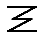
Or maybe this… just for fun…
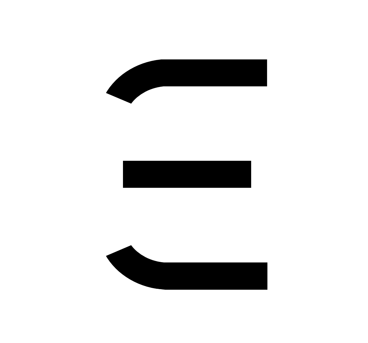
Derived from Ξ, but with continuous drawing without lifting. Allows more room for artistic calligraphy. Quicker writing may be possible.
Update (Oct 6, 2020):
Slight refinement for aesthetic value and also a minor display of caligraphic potential. Continuous single stroke that also observes the natural grid of magic that symbolizes totality and completion. Hope the Ethereum community likes it.
![]()
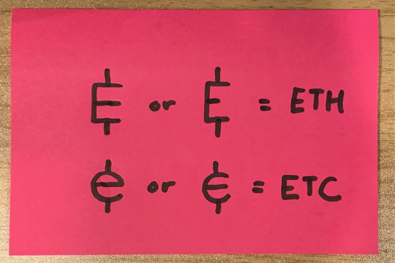
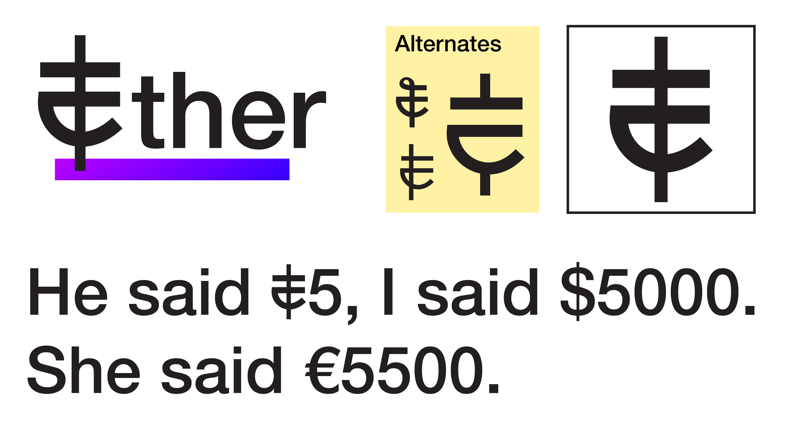
Imho, here are the currency symbols we should use for ETH and ETC. These symbols are simple and easy to comprehend. These cryptos are mainstays at this point, they add real value and should have good simple currency symbols. These are two great currency symbols that should be adopted ASAP.
3 Likes
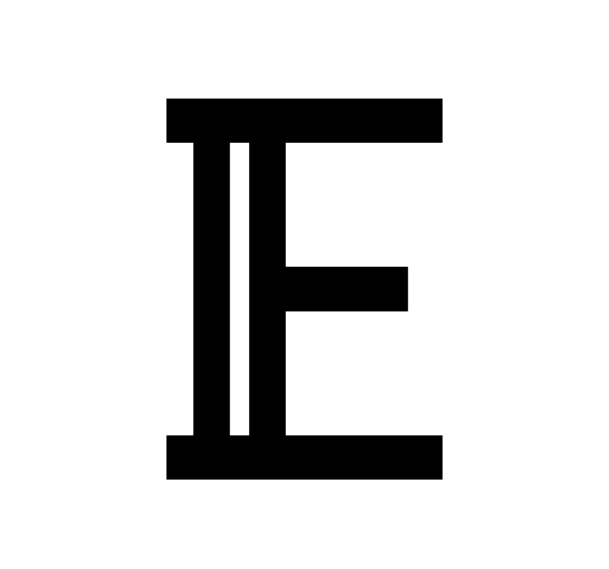
How about this. The symbol fulfills three important criteria; it looks like:
- the Ethereum logo,
- an upper-case E,
- and a currency symbol.
Fitting for a triple point asset.
Ethereum Currency Symbol.pdf (5.9 KB)

I think the ETC below makes sense. I I want to write a currency or envision it in my mind, I’d want to either write it all in one drop (without taking my pen off the paper - IOG) or in 2 or a maximum of 3. Anything above 3 drops is not generally rational (in general, as a currency).
So, I like these, and they look like currencies.
But the lower case e is the cutest, and will stick to the mind easily. @musajoemo
1 Like
Should we arrange a poll and discussion phase on r/ethereum?
Step 1. Announce a request for proposals within X weeks. It would be desirable to reach designers that do not frequent ethresear.ch
Step 2. Have an open poll among the members
Step 3. No commitment concerning using the poll winner, but rather a further discussion, sending a summary to the foundation?
Personally I believe we should just stick with the original. The Ξ has already been widely accepted and adopted. That could be one reason why this post has been abandoned for over a year until last week.
2 Likes
I guess you are right actually.
While we’re on this type of topic, what do y’all think about some sort of cute official mascot? I’m thinking a cute animal, kinda like what Linux did with Tux the Penguin. For all its fault Dogecoin saw a lot of widespread adoption because it had a cute mascot. I think it’s especially important for Ethereum, because to the average person it’s often viewed as the most complex and least accessible of the major blockchains.
We have Leslie the rhino, name after the American computer scientist Leslie Lamport.
Rhinos are maybe not cute for everybody but they are are mythical animals like unicorns.
I don’t know if Leslie is the mascot only for the launchpad.
1 Like
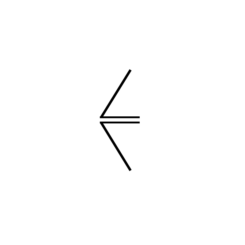
Just wanted to throw my 2 cents out there, I think the open Lozenge (unfilled) with a couple of lines through it would work pretty well.
I feel like this is a job for Wall-E.
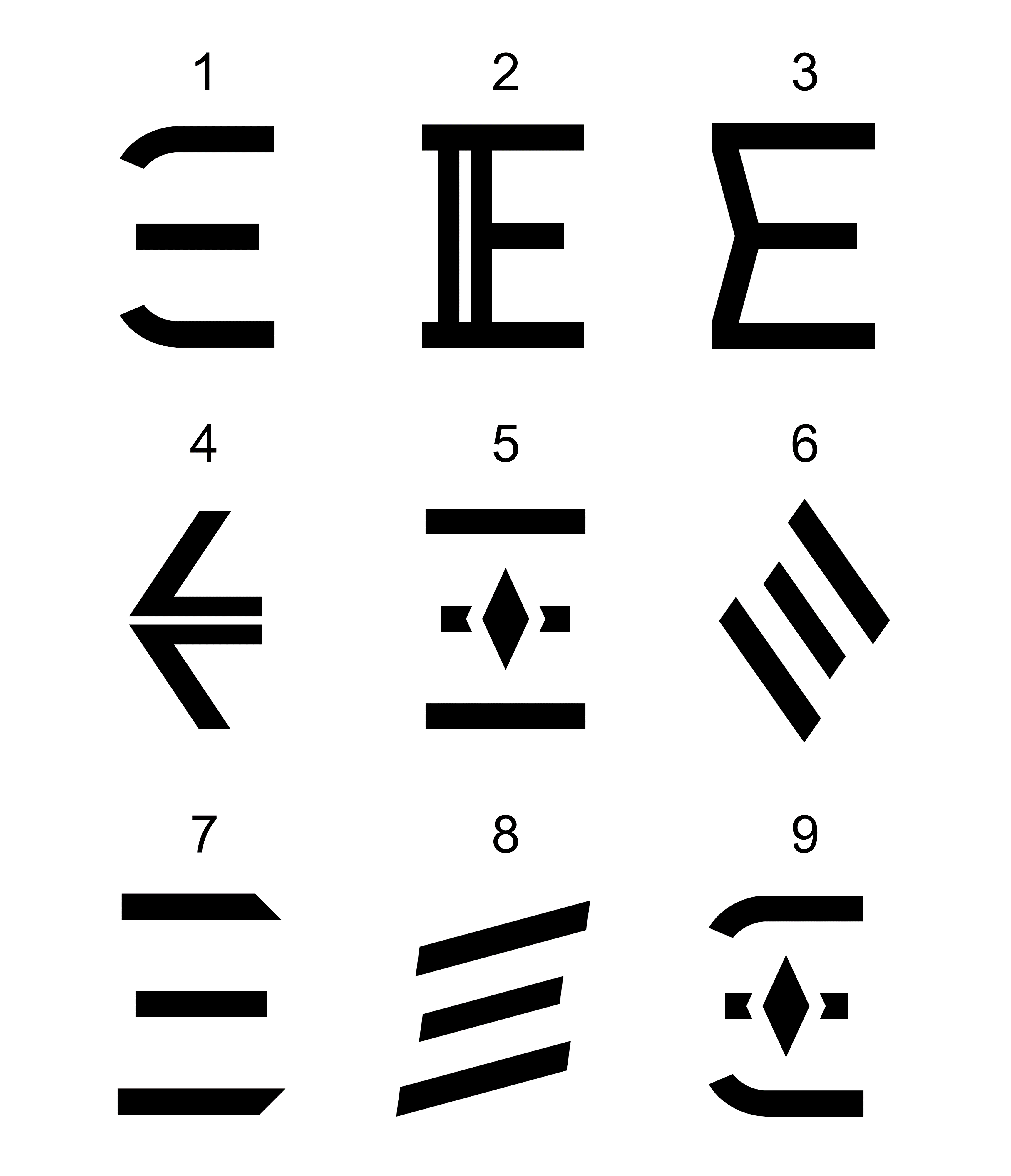
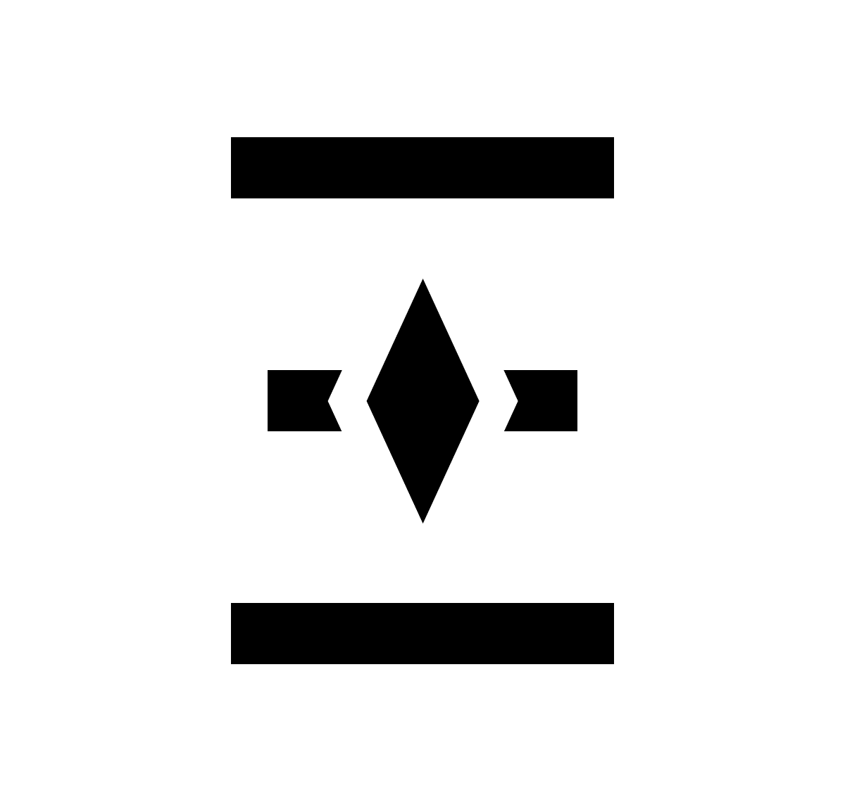
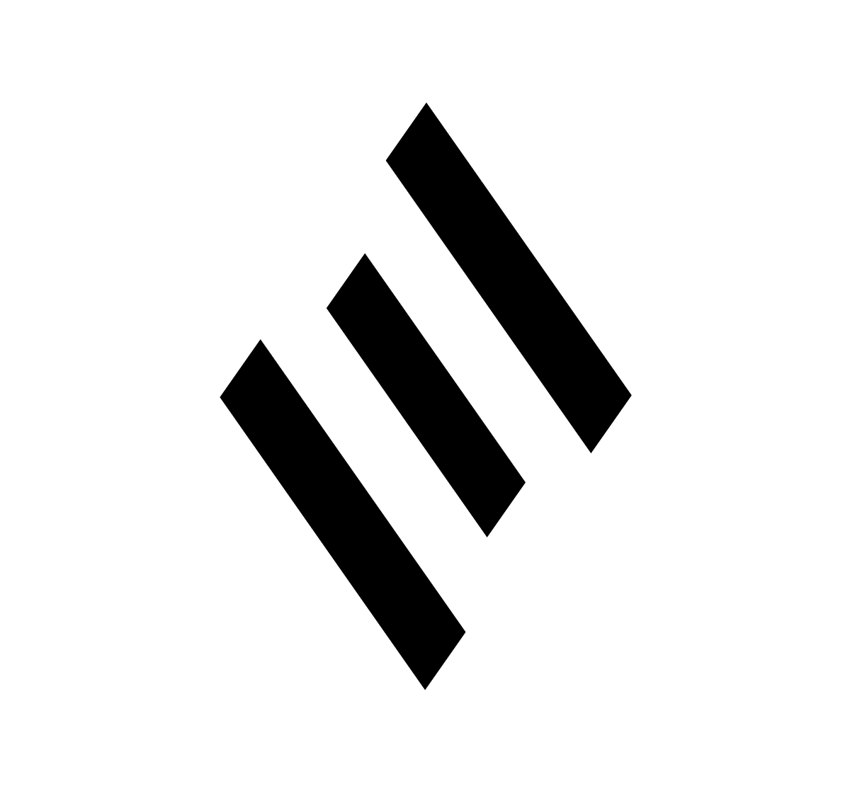
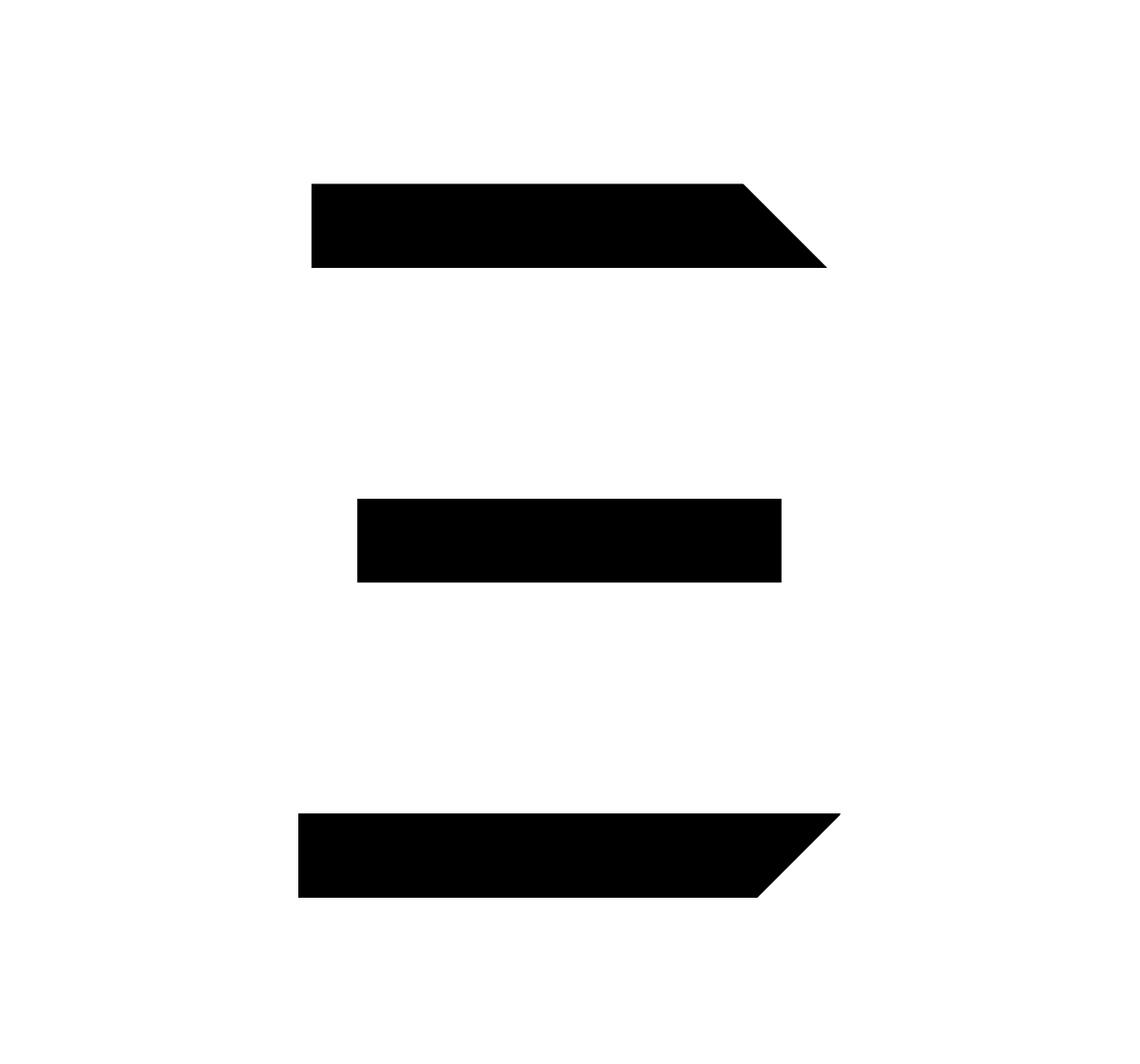
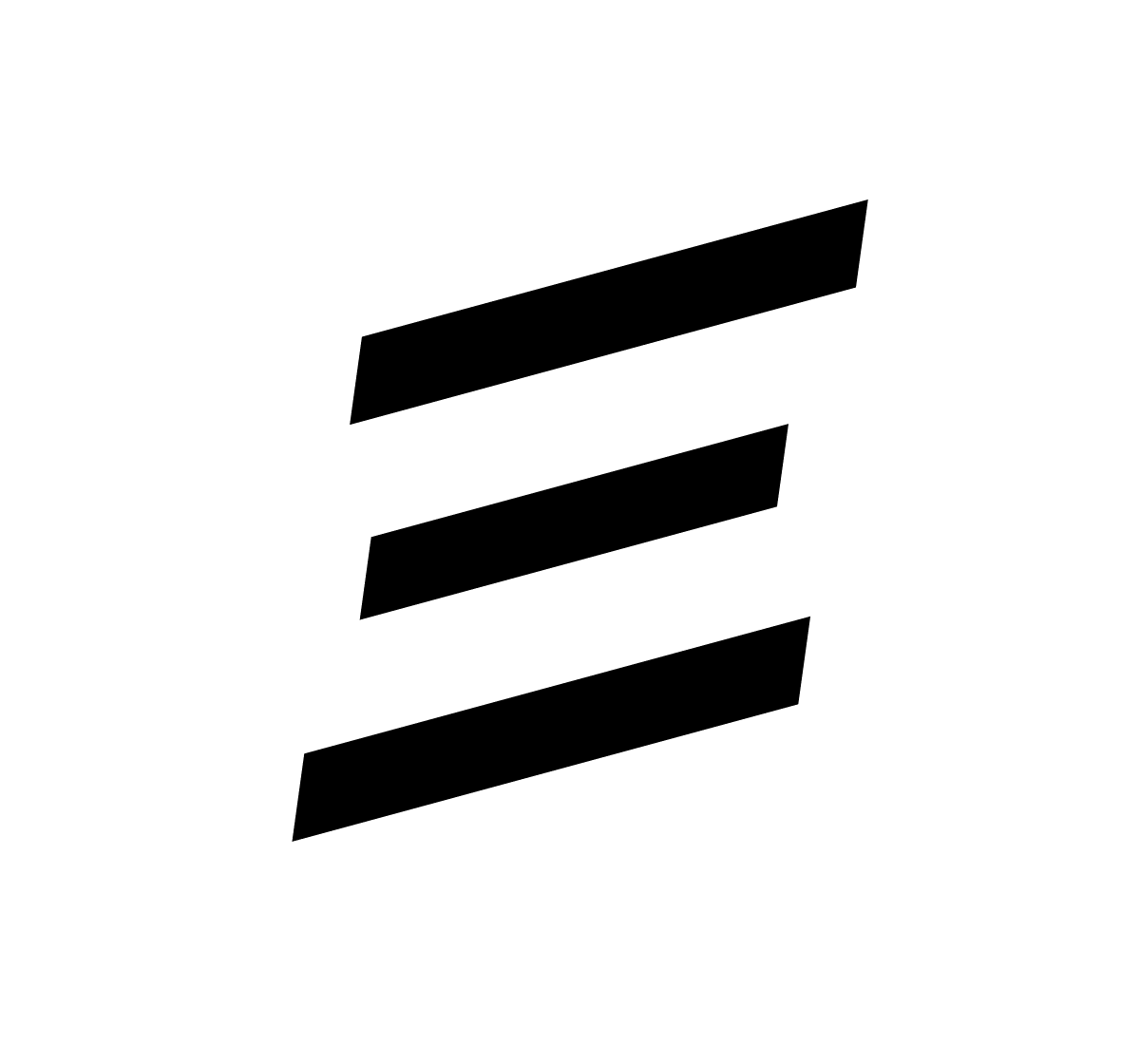
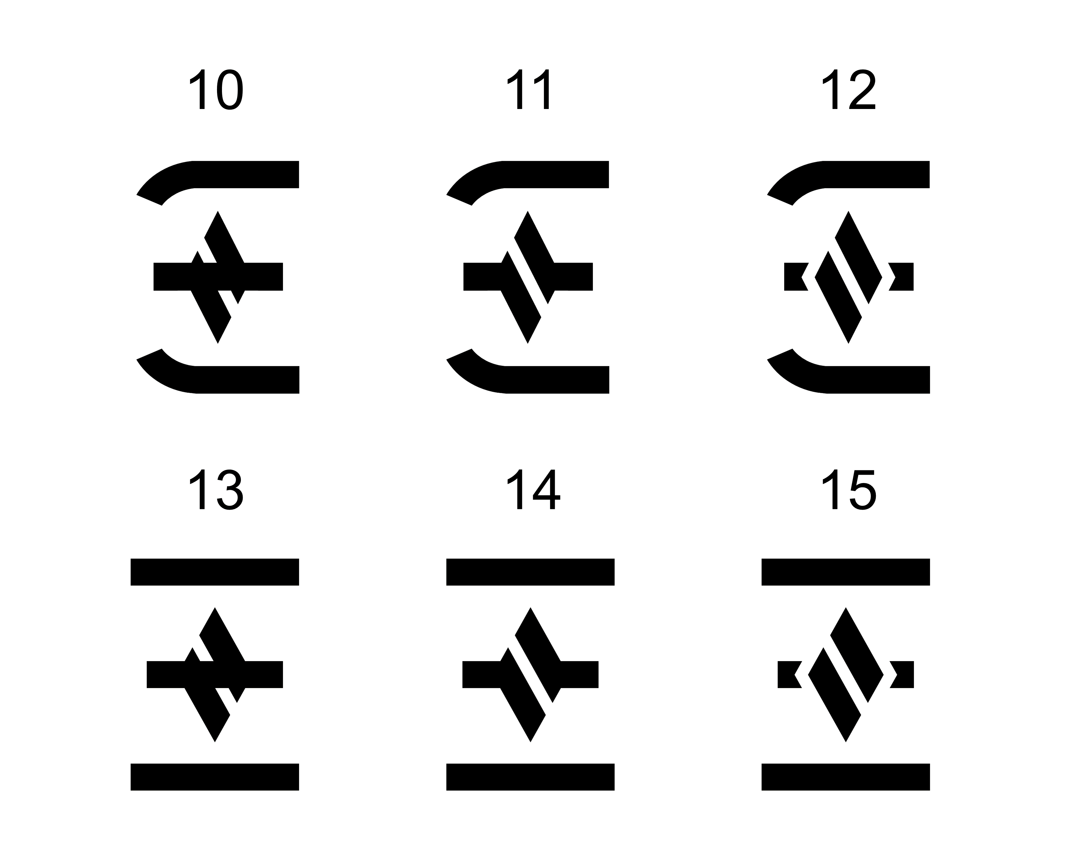
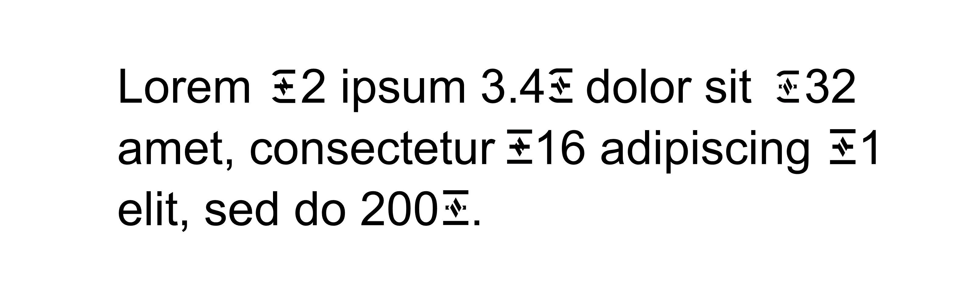
In light of Justin Drake’s recent tweet I want to revisit this topic again. The way I see it, at the beginning of Ethereum’s existence, users were locked to existing Unicode characters and settled on the best that were available. But we are no longer at that point. To create our own unique character, we first need to explore the “feature space” of potential currency symbols for Ethereum. Perhaps after a serious effort, a symbol could emerge that people can more or less agree on is preferable to uppercase Xi Ξ. Or perhaps we would not find such a symbol, but it would at least be desirable to try. I have designed 9 different options which could be a starting point for discussion and iteration. In many versions, I tried to retain the “heritage” of Ξ and combine it with the logo as well as forming an uppercase E.
This is what they look like in running text (Arial):

I will just write a few words about each design.
-
By bending down the top and bottom lines of Ξ, the symbol will resemble an E more clearly.
-
Adding two vertical lines.
-
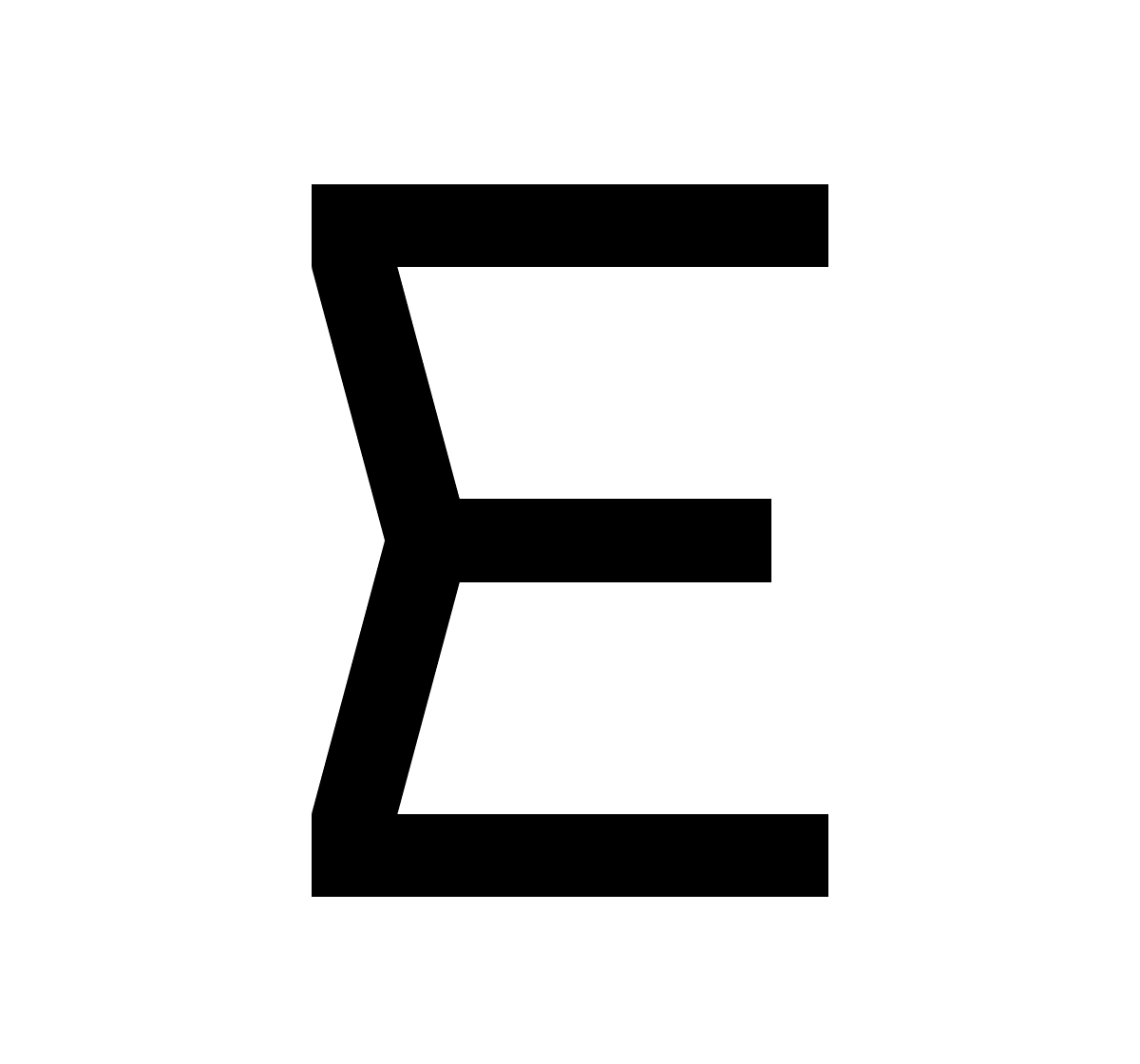
Two diagonal lines resembling half of the logo intersect at the middle bar to form an E. Going back to the start a little since the original Ethereum logo was created by combining two Sigma symbols.
-
Using the left half of the logo to form an E. This one works better in lighter fonts I believe, see for example the version I tweeted in response to Justin.
-
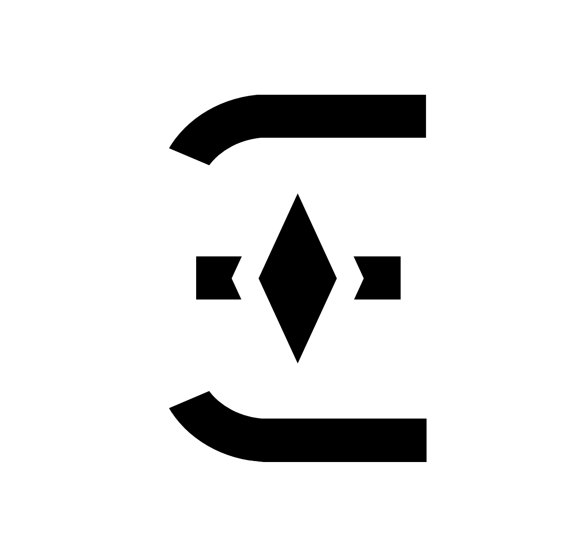
The logo floating on top of Xi. I tried various versions, for example using black outer lines with a white fill but this was the one that looked the best in my opinion. I also tried first with a vertical line from top to bottom but the religious connotations seem unfitting for a world currency.
- Xi shaped according to the logo. The direction of the lines can be flipped. Similar designs have been used for local meetups I believe.
- Xi with “minimum viable alteration”. Can also be applied to other edges instead.
- Xi shaped according to a tilted logo. The direction of the lines can be flipped since many other logos are similar.
- Combining No.1 and No. 5. The logo floats on top of Xi with bent lines to resemble an E. In my opinion, this version feels both like Ethereum and a currency.
Are there any particular designs among these that you think holds promise?
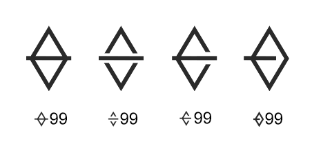
I realized that it is possible to fit two lines inside of the logo which will make it look more like a currency symbol. Just to show you what it looks like:
Of course, the logo could be tilted to straighten the lines and make them more readily visible, as well as working with the width of the lines and sizes of the various parts to make it look the best in running text.
Holy— I didn’t realize it was that long and that thorough.
I personally believe the Ether currency symbolism should distinguish itself from Ethereum design.
The ⧫ icon is a nice logo for a project, but it was not designed to be a currency symbol.
There are some really good suggestions above, but most of them don’t fit along other currencies from my point of view.
The fact that Ethereum is purely electronic means that the use cases for writing the symbol are few, but dismissing handwriting sets you up for a design trap:
All internationally accepted currency symbols have evolved over years of handwriting. They’re optimized for ease of writing and that’s why they look like that. The more modern ones take it into account too. Designing a currency symbol that’s easy to write is what makes it fit in.
Ξ is better than ⧫ but still lacking as currency sign. My personal concerns are:
- It has to be accessible and easy to write (Meaning no complex small forms or huge number of strokes, easier to see in lower ppi too)
- It can’t look like a logotype (AFAIK Unicode is going to reject it if it looks like you’re trying to sneak in a commercial logo)
- It has to be related to Ether (An E, e, or anything else you can think of that immediately relates to Ether/blockchain)
I’d love to see the Ethereum foundation host a contest with stricter rules than above, and actually push for a decent Ether currency symbol. Ethereum and Ether sometimes feel like they have a design language identity crisis.
A good currency symbol would benefit the community and crypto adoption tremendously.
I believe one of the reasons bitcoin is so popular is because of it’s simple design language and presentation.
I hope someone here has a different point of view on something I said, please reply because the more we talk about this the more refined it gets.
I attach a quick sketch as an example of what I think fits my points above.
(In a perfect world the corners and line weights are refined)
I’m not totally happy with it, and I want to see more community symbol propositions. Let’s jam.
Way late to this discussion, and hate to bring up a Zombie, but but I’ve been using Ξ in extensive use for a project and not only do I love it, it’s become instantly recognizable in my area.
Is this still a topic anywhere or has it been pretty much settles to the Ξ symbol? Either way, I’m going to use it lol.
I don’t write it often, but it’s concise, easy to recognize, and… well, it’s an E (kind of). For those who say it’s not a currency symbol, I think it fits perfectly. Most currency symbols can be drawn with between 2 & 3 lifts of the pen, none if you’re lazy.
The other symbols are glyphs, which are fine if you’re representing the concept of Ethereum as an idea, however the lozenge does conflict with numerous historical uses of it:
- It’s a statement separator in some programming languages.
- Subtotal on old calculators (and a TI graphing calculator from the early 2000’s. Retro!
- It’s heavily used in mathematics and logical expressions.
- If you’re in the US or Canada, you see the lozenge and you think “Bike lane, watch out!” or “Yes, I’ve got 2 in the car, HOV time!”
I know it’s a matter of taste, but if the US dollar was represented by it’s glyph representation, it would be the US Federal Reserve system logo:
It is stamped on every bill, as the “$” doesn’t actually show up anywhere on any bill I’ve ever seen. This is the universal glyph of the USD.
Originally the USD symbol was an amalgamation of U & S, later shortened by removing a line, Ehereum, to me at least seems quite obviously to fit with Ξ
There’s really only one thing that most currencies have in common and that’s a strikethrough, however not only does Ξ appear to be a loose representation of ETH, it does not have a strike as the state is always brought to balance, and the three lines nicely represent state channels.
There’s truly no symbol that can be created and understood to mean something without a frame of reference to said thing first. If BTC is ₿ why complicate things when we can use Ξ for Ether. Both lozenges look like a number of points in a game with no real value. I think this is vastly overcomplicated.
Someone tell me nothing else has come of this! Because when preparing invoices, etc, I use Ξ for everything. It’s easy to type and draw, and with the right marketing (just showing it in public would be a good start) there’s no need to reinvent the wheel.
@ChainSafe You’ve basically drawn the Theta logo!
lol, and officially brought the ETH currency logo into another galaxy (and blockchain).
@mateo You outline three concerns:
- Accessible and easy to write (no complex forms, large # strokes)
- No logotype
- Related to Ether
You then present some examples, all of which contain complex forms… an inordinate number of strokes, and have absolutely nothing to do with Ether. No offense but from a design perspectve, you broke all your rules you set out to make. It’s not just about what Ether is as a name… it’s about the philosophy.
IMO Ξ is perfect. It’s an E at first glance, is lined up correctly in every font to work for a currency prefix, it represents a start and finish (no curved lines) for the execution of distinct code, layers: runtime environment, consensus, application/contract layer.
Sure, it has a similar looking function in some programming languages that isn’t very prevelant unless you’re using stylized fonts. Sometimes the easiest, most straightforward answer simply is the best. If it gets used enough, it will have staying power.
And, it’s way easier to write than BTC’s logo.
Again, if there’s another post this went to please redirect me, I just wanted to put my 2 wei in on the situation as I commonly use this and am working on front end apps that represent ETH along with many currencies and having a standard is important. I’ve been using this as it’s become more common, I believe most exchanges and Coinbase even use it.
If there’s some lesser symbol being discussed, please point me to it so I can logically dismember it.
Thank you…
Cheers!
2 Likes